Liberty Leading the People by Eugene Delacroix
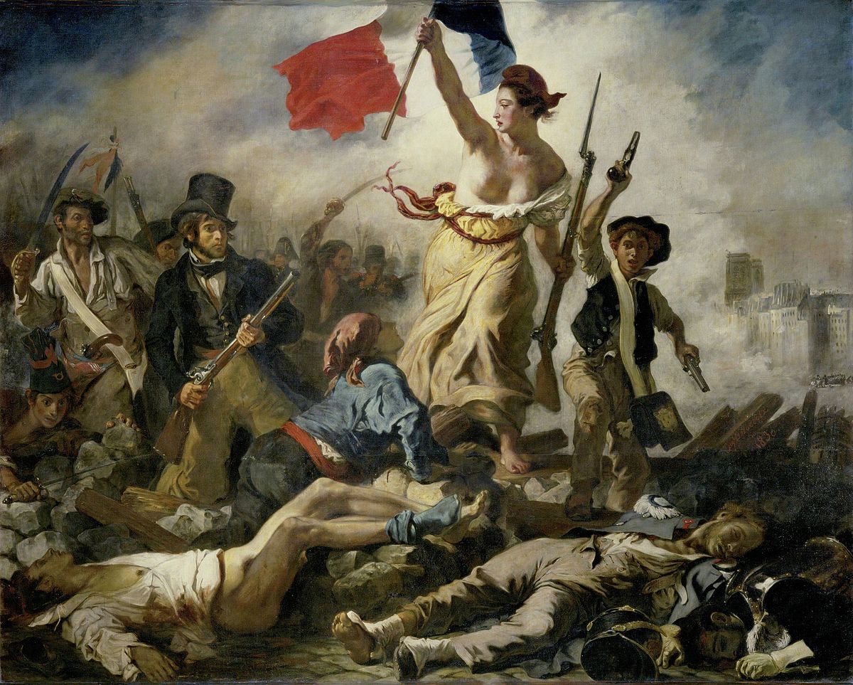
“Liberty Leading the People” was painted by Eugene Delacroix in 1830. The painting was very exhibited at The Salon in 1831. The Salon was an art exhibit in Paris. The painting now hangs at the Louvre in Paris. Delacroix painted “Liberty Leading the People” following the July Revolution of 1830. The painting depicts “lady liberty” leading a group of people over a barricade of the fallen and wounded. She is holding the flag of the French Revolution in one hand and a bayonetted musket in the other. Delacroix has “lady liberty” wearing a Phrygian hat, which during the French Revolution became a symbol of liberty for France.
“Liberty Leading the People” was a romanticized painting. Just by first glance, I can tell Delacroix put a lot of emotions behind it. He put “lady liberty” on a pedestal to signified the French had been liberated from King Charles X. The ideal subject matter of this painting was “horrible tragedies,” many people died or were wounded from the July Revolution, as with any war or revolution. I really like the smokey background of this painting. It makes it seem like the people are walking out of the smoke and into the clear. The people in the smoke are kind of blurry or hazed, I like this technique used by Delacroix. Another thing I notice is the paleness of the bodies in front of “lady liberty.” I love the use of color throughout the whole piece.
The Nightmare by Henry Fuseli
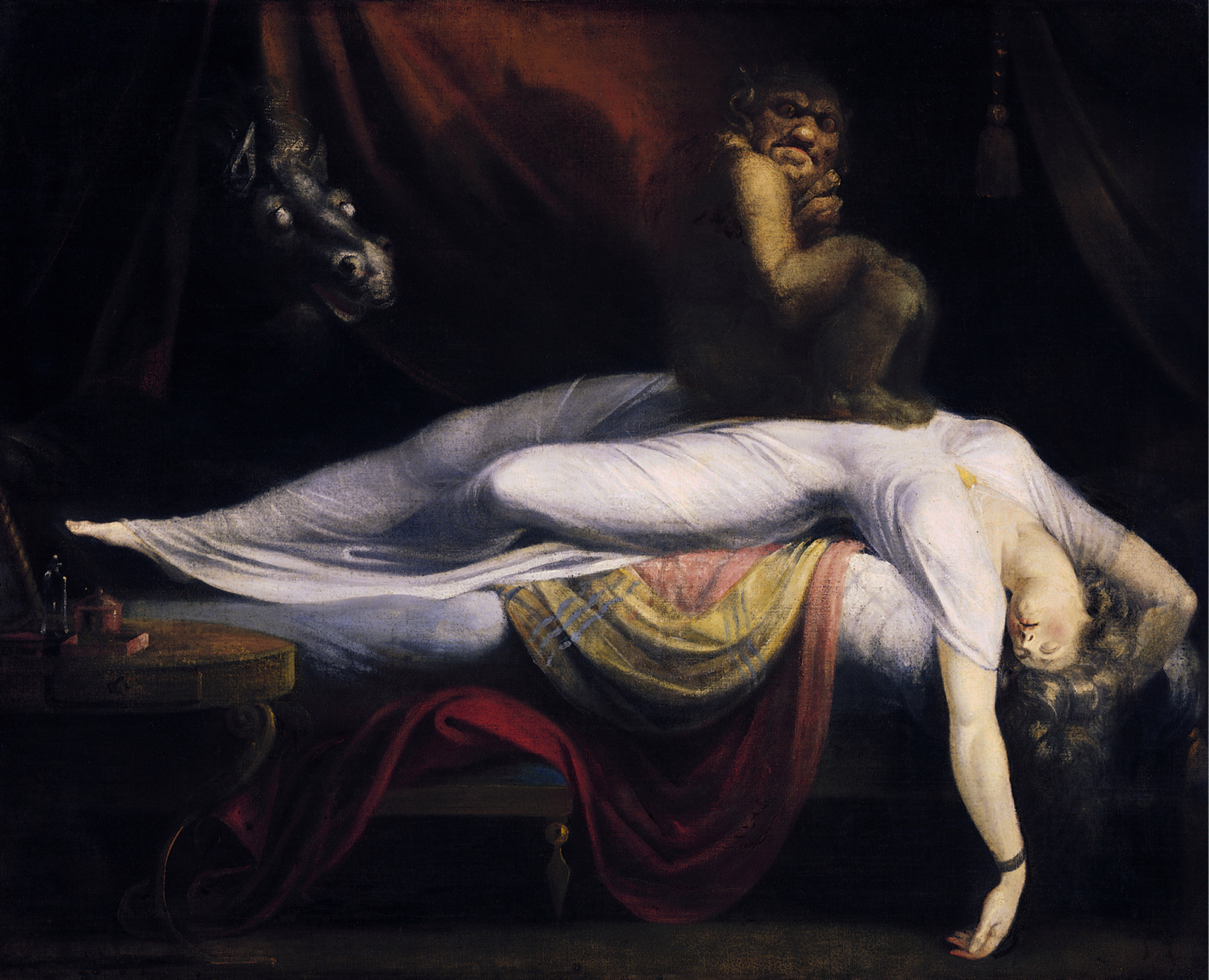
“The Nightmare” was created by Henry Fuseli. The painting was very displayed at the annual Royal Academy exhibit in London in 1782, where is shocked and frightened many viewers. The painting is now housed at the Detroit Institute of Arts. “The Nightmare” depicts a women sleeping with her arms and head very limp. She has a demon-like creature sitting on her chest and what looks to be a horse-like creature peering in at her. Fuseli’s painting lacked reference to literary or religious themes, but he did influence literature like Edgar Allen Poe and Mary Shelley.
At first, this painting kind of creeped me out, as it would anyone, but now that I’ve been looking at it, I really appreciate the big contrast between light and dark. Because the woman is painted in all white, she is really the center of the painting. The dark colors of the background really make her body pop. Fuseli used a chiaroscuro effect to create the contrast between the light and the dark. I love the shadows in the background and the use of shades to make it seem like the light is coming in from the front. The shading under the woman’s body really gives her a 3D effect, almost like her body is popping out of the painting.
The Stone Breakers by Gustave Courbet
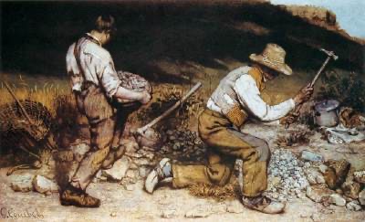
“The Stone Breakers” was created by Gustave Courbet in 1849. The painting was first exhibited at the Salon in 1850. It was destroyed during World War 2, along with 154 other paintings, when a transfer vehicle moving paintings was bombed by Allied forces near Dresden, February 1945.
I think that “The Stone Breakers” is very boring to look at. The painting doesn’t have any exciting colors, just mainly brown, white, and gray. I believe that this painting does tell a little story though if you look at it close enough. Two middle or lower class men, working to make money for their family. In the bottom right corner, it looks like there’s a pot, maybe for cooking food. I am kind of confused by the shading in the background because in the top right corner it’s clear blue sky. I wonder if there’s a group of trees that the sun is casting a shadow over or maybe clouds. I do appreciate the details of the rocks and the ground, it gives the painting a bumpy textured look.
Woman Reading by Henri Matisse
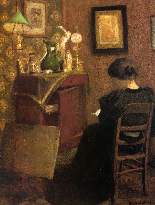
“Woman Reading” was painted by Henri Matisse in 1894. The artwork was first exhibited in 1896 at the Salon du Champ-de-Mars and is now owned by the Museum of Modern Art in Paris.
“Woman Reading” shows a “calm and tranquil scene” (Woman Reading). The woman’s back is turned from the viewer and the room is rather messy. Again, I think this painting is boring to look at. It doesn’t include any vibrant or interesting colors. The main subject of the painting is very boring too, just a woman sitting, reading a book. I do like the lighting on the bookshelf. It looks like some of the things on there are shining. But, other than that I don’t like this painting.
Overall, I enjoy romanticized painting a lot more than realism ones. I think that romantic painting have more interesting colors and have more of a meaningful message relating to a broader topic. Realism painting are boring to look at for me and have very drab colors.
Works Cited
Zelazko, Alicja. “Liberty Leading the People.” Encyclopædia Britannica, Encyclopædia Britannica, Inc., 3 May 2018, https://www.britannica.com/topic/Liberty-Leading-the-People#ref337446
“The Stone Breakers, 1849 by Gustave Courbet.” The Stone Breakers, 1849, https://www.gustave-courbet.com/the-stonebreakers.jsp
Paulson, Noelle, and Noelle Paulson. “Henry Fuseli, The Nightmare.” Smarthistory, https://smarthistory.org/henry-fuseli-the-nightmare/
“Woman Reading, 1894 by Henri Matisse.” Henri Matisse, https://www.henrimatisse.org/woman-reading.jsp

Lane,
I think that you did a great job of describing the two romantic paintings and realist paintings. I completely agree about the colors in the realist paintings being drab and gives the pieces a boring look. The romantic paintings, on the other hand, do have much more vibrant colors and are visually more interesting to look at.
For me, however, the women of the two romantic pieces make me dislike these two pieces. My problem with lady liberty is that she is a bare-breasted woman with unusually perky breasts and barefoot, leading a charge in battle. Then below her is a dead guy who somehow lost his pants, shoes, and one sock. It’s just too romanticized for me.
The woman in “The Nightmare” looks broken physically. There is just something about the way she is laying that is unnatural. Maybe that is intentional by the artist to give the piece a more unsettling feeling, but it looks like a flaw to me. So I actually like the boring drab realist paintings better.
Mike
LikeLike