Japanese Woodblock Prints

Japanese woodblock prints began being produced during the Edo period (1603 – 1867). “To create a woodblock print in the traditional Japanese style, an artist would first draw an image onto washi, a thin yet durable type of paper. The washi would then be glued to a block of wood, and—using the drawing’s outlines as a guide—the artist would carve the image into its surface. The artist would then apply ink to the relief. A piece of paper would be placed on top of it, and a flat tool called a baren would help transfer the ink to the paper. To incorporate multiple colors into the same work, artists would simply repeat the entire process, creating separate woodblocks and painting each with a different pigment.” (Shovava)

Suzuki Harunobu (1725-1770)

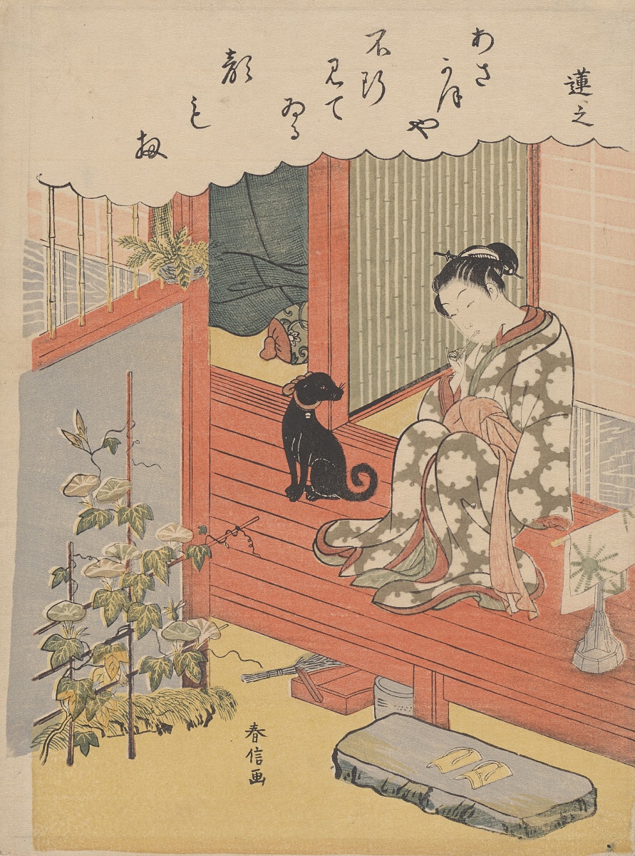
“Renshi” was created in 1768 by Suzuki Harunobu. This print, along with others from his collection, are now located in the Portland Art Museum. Harunobu was known for his typical China and Japan everyday life scenes. He had also dominated the field of full color prints. This technique uses 5 or more woodblocks for each impression and the final print was called “brocade pictures.”

I like the different patterns throughout this print. On the wall behind the woman, there is a block pattern and a striped pattern, which looks like bamboo. There is also a pattern on the woman’s robe, it looks like leaves or some sort of suns. I also love how detailed this print is, especially the plant right outside the door. The plant’s leaves look very realistic. It’s amazing to think this print was made from being carved into a wood block, then pressed perfectly to have ink transferred.

Utamaro (1753-1806)

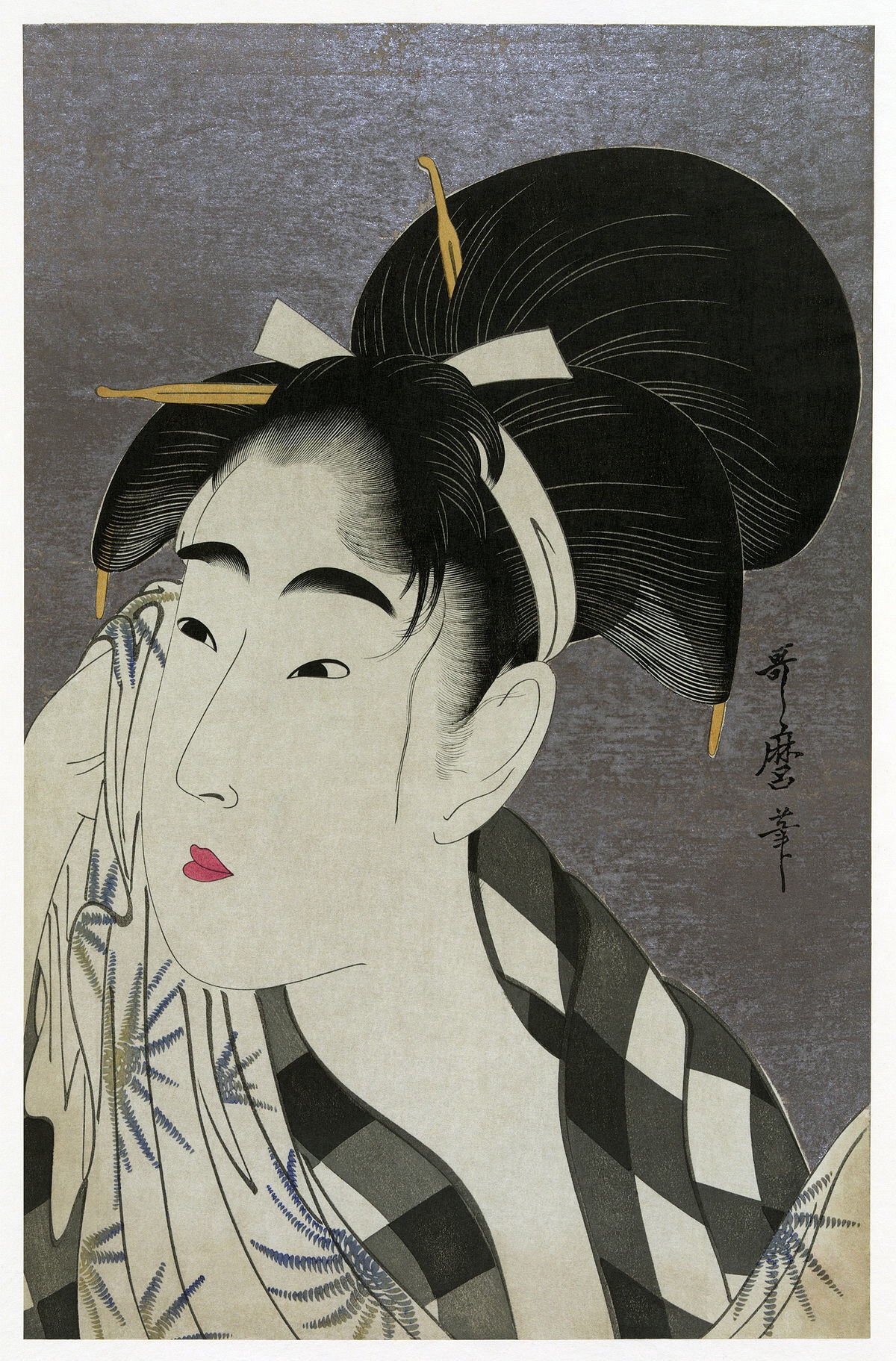
“Woman Wiping Sweat” was painted in 1798 by Utamaro. Utamaro is best know for his “large-headed pictures of beautiful women” of the 1790s.

I love the patterns throughout this print. The plaid on her shirt or shall contrasts well with the sun pattern of her shall. I love the sun pattern especially because of the movement from yellow in the middle to blue on the tips. The woman’s face doesn’t quite look 3D, it looks quite flat. I love the details to her hair, it really looks like individual strands. The bold red color of her lips contrast really well to her face, making the color pop from the print.

Katsushika Hokusai (1760-1849)

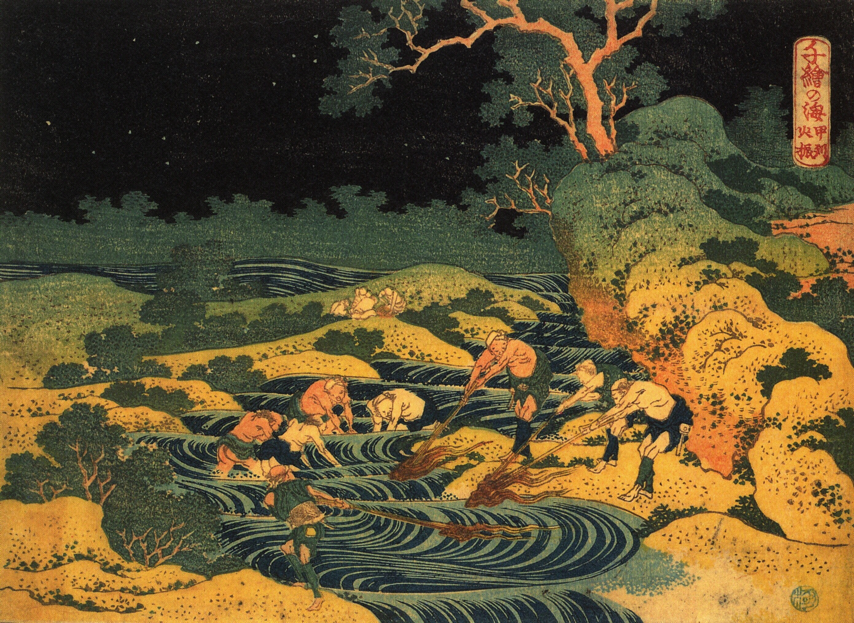
“Fishing by Torchlight in Kai Province” was created by Hokusai in 1833. The print is located at the Museum of Fine Arts in Boston. Hokusai is best known for “The Great Wave Of Kanagawa.”

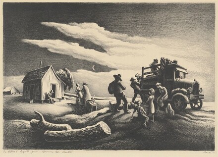
I love the moment from color to color in this print, going from light to dark, bottom to top. The spotted patterns of the tree and ground really add contrast to the colors. The different lines throughout the print give it a sense of rolling hills and rolling waves. The patterns of the water give it a sense of fast moving water. There’s even little splashes around the worker’s feet. It’s amazing how detailed someone could carve to create a print like this.

Hiroshige (1797-1858)

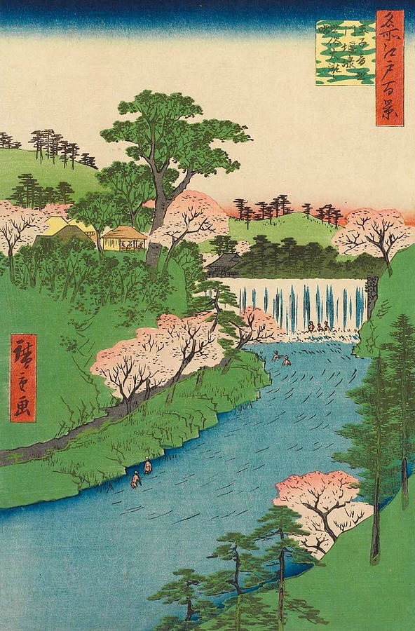
“Dam on the Otonashi River in Oji” was created by Hiroshige in 1857. The print also has the nickname “The Great Waterfall.” The painting depicts a popular park covered with cherry blossoms and other trees.

I love the pink colors throughout the print. The fading light pink to darker in the trees is very beautiful, I love cherry blossom trees. The different shades of blue in the river give it a sense of depth or shade of something overhead. I also love the texture of the waterfall, it gives a crashing effect towards the bottom. The whole mood of the print is kind of calm and tranquil. It reminds me of a quiet scene where I would love to visit. This is my favorite print out of the ones I have talked about.

Works Cited

“Hokusai.” Artnet, http://www.artnet.com/artists/katsushika-hokusai/

Shovava. “The Unique History and Exquisite Aesthetic of Japan’s Ethereal Woodblock Prints.” My Modern Met, 2 Aug. 2019, https://mymodernmet.com/ukiyo-e-japanese-woodblock-prints/

“Suzuki Harunobu and the Culture of Color.” Portland Art Museum, https://portlandartmuseum.org/exhibitions/suzuki-harunobu/

The Editors of Encyclopaedia Britannica. “Utamaro.” Encyclopædia Britannica, Encyclopædia Britannica, Inc., 27 Oct. 2019, https://www.britannica.com/biography/Utamaro

“Tokyo’s Great Waterfall: ‘Dam on the Otonashi River in Ōji.’” Nippon.com, 6 Mar. 2019, https://www.nippon.com/en/guide-to-japan/gu004003/tokyo’s-great-waterfall-dam-on-the-otonashi-river-in-oji.html

Postmodern Optical Illusion Street Art

Optical illusion art began showing up in the 1950’s with the contrasts between black and white. Artists wanted to confuse the public’s perception of things. Throughout the years, the rise of technology has had a great influence on optical illusion art. It pushed artists to push more boundaries of space and perception. 3D street art began becoming more prominent in the 1980’s. Below are some 3D street art that more recent, all pay a lot of attention to detail.

Oh Crumbs!

“Oh Crumbs!” was painted by Julian Beever in the 2000’s. This street art painting is located in Salamanca, Spain. Beever is a British artist who began anamorphic painting in the early ’90s, meaning he created illusions of three dimensions when viewed from a particular angle. Anamorphic painting can’t be seen as 3D by a naked eye, you can only tell from a photo of it. I love all the different shades of blue throughout this street art painting. The darker blue gives the sense of depth. Especially the water, the darker the blue the deeper the depth. I also love how the little chunks of ice look like they are floating and they give the illusion that you can see the bottom half of the ice under the water.

White Water Rafting

“White Water Rafting” was also created by Julian Beever. This piece of street art is located in Charleston, West Virginia. I love the contrast between the blue and the white, it gives it a sense of water rushing and crashing down. The contrast also gives the wavy texture to the water. I also love the different cracks and the opening filling of the stream flowing through the sidewalk. The shading gives a depth effect, like the water is going under the sidewalk. I love looking at all of Julian Beever’s 3D painting, he makes realistic, funny interactions with them.

The Tower

“The Tower” was created by Kurt Wenner. This street art painting is located in Concepcion, Chili. Kurt Wenner is an American artist who is best known for his development of 3D pavement art. I love the sense of depth in this painting. It really gives the effect that you are standing on the top of the buildings looking far down. I also love all the bright colors, it really makes the bricks on the buildings pop. The first detail that catches my eye is the kites flying over top of the buildings. Wenner uses a depth effect called macropsia, where objects within an affected section of the visual field appear larger than normal, causing the person to feel smaller than they actually are.

The Belgium Underground

“The Belgium Underground” was also created Kurt Wenner. This street art painting is located in Brussels, Belgium. At first glance, I love the stairway going down to the underground. The shading of them gives them a downward effect. On the wall, I love how it seems like the inside of the underground. From the angle of the photo, it’s almost like you are peering down into the busyness of it. I love the attention to detail of the underground, from the people to the other distant tunnel. This street painting really gives me the sense of wanting more and makes me curious of what is actually in the Belgium underground.

The Crevasse

“The Crevasse” was created by Edgar Mueller in August of 2008. This street art painting is located in Dun Laoghaire, Ireland. “The Crevasse” was supported by the Goethe Institution Germany at the “Festival of World Culture.” Mueller is my favorite artist out of the 3. His works just amaze me by how big and detailed they are. “The Crevasse” really makes me think I am looking at a crack in a glacier about to fall in. I love his use of different shades of blue to create depth to the painting. I also love his attention to detail of the “falling” ice chunks. I believe this detail gives the painting more character and more realism.

Tribute to Mt. Fuji

“Tribute to Mt. Fuji” was also created by Edgar Mueller in August of 2013. The street art painting is located in the Yamanashi Prefectural Museum of Art in Kofu, Japan. I am just in awe with this painting, the attention to detail is amazing. One thing I love about it is the waterfall flowing down the center of the painting. The color of the water changes from yellow to light blue to white when crashing into the water below. At the bottom of the waterfall, I love all the different colors of blue and greens and the contrast between the lighter and darker colors giving it a wavy texture. I also love all the bright pastel colors in the background, it gives it an almost magical, light tone. Another thing I love about this painting if the meaning behind it. The painting is like you are peering into Mt. Fuji and it looks magical and mystical, Mueller wanted that. He was fascinated by the beautiful nature in this area and expressed it through his painting.

Works Cited

3D Illusions, http://www.julianbeever.net/index.php/phoca-gallery-3d

“3D Pavement Art.” Kurt Wenner :: Master Artist, https://kurtwenner.com/3d-pavement-art/

“3D Pavement Art.” Edgar Mueller [Projects], http://www.metanamorph.com/index.php?site=projects

The Influence of The Great Depression (1930s)

Departure of the Joads

“Departure of the Joads” was created by Thomas Hart Benton in 1939. The painting is now located in New York City. Benton created this painting for Steinbeck’s book The Grapes of Wrath. The Grapes of Wrath is about the Joads family having to be forced from their farm to California in the Depression-era Oklahoma Dust Bowl. The Dust Bowl was given its name from a drought that happened in the 1930s. It forced many farmers out of their homes and many lost their economic income, making life very hard.

“Departure of the Joads” depicts the Joad moving out of their home with whatever they can carry in their car. I really like how the painting is in black and white. The shading in this painting is phenomenal, you can really tell the differences of lighting within it. The one thing that I am having a hard time distinguishing is if the painting is portrayed in the morning or the night. The shading from the right side of the painting suggests that the sun is shining from that side, casting shadows behind the people. I also love the details in the grass and the logs. The way the logs and the ground is drawn makes it looks like the car is sitting upon a hill, almost of 3D effect. Also the shading behind the car gives the hill more depth.

American Gothic

“American Gothic” was taken in 1942 in Washington D.C. by Gordon Parks. The photograph depicts Ella Watson, a cleaning lady in the Farm Security Administration offices where Parks worked. “‘American Gothic’ – a reference to the famous Grant Wood painting — is a construction that afforded rare attention to a black female subject who was not a celebrity or entertainer, but a mother and a worker.” (Willis)

“American Gothic” really caught my eye when I was looking for photographs/paintings. My eye caught her polka-dot dress and I was wondering why she was holding a broom and a mop while standing in front of an American flag. I really like the meaning behind the photograph. Parks wanted to create a portfolio of Mrs. Watson’s everyday life, from work to home. I really admire that he wanted to capture a mother and a worker, not only that but an African-American mother and worker. More on the meaning, the underlying background of the portfolio portrays long working hours then going home to making dinner and caring for children. Underneath is a photo from Parks’ portfolio of Ella Watson caring for her grandchildren.

Drought

“Drought” was created by Jacob Kainen in 1935. The sketch is apart of the Federal Art Project in New York City. “Drought” depicts a distressed farmer during The Dust Bowl of the 1930s. “You may notice the farmer’s downcast appearance as well as the twisted, dead tree, sandy-looking soil, bony livestock, and sparse vegetation in the fields. Discarded wagon wheels may indicate there is nothing to harvest or transport.” (National Art Gallery).

I was drawn to this sketch because of the detail everything. The shading throughout “Drought” is perfect, it really gives the sketch a lot of depth and detail. One of my favorite parts of the sketch is the tree. Kainen did a great job of making it look really beaten down by the wind at this time, almost portraying the tree as being on its last life. The background of the sketch is really eye-catching too. He makes it look totally bare, portraying no harvesting going on due to the Dust Bowl. “Drought” does a really good job of depicting what the land looked like after the Dust Bowl of the 1930s and the devastation effect it had on farmers and many other people.

Works Cited

Benton, Thomas Hart. “Departure of the Joads, from The Grapes of Wrath.” The Art Institute of Chicago, Prints and Drawings, 1 Jan. 1970, https://www.artic.edu/artworks/40135/departure-of-the-joads-from-the-grapes-of-wrath

Willis, Deborah. “Ella Watson: The Empowered Woman of Gordon Parks’s ‘American Gothic’.” The New York Times, The New York Times, 14 May 2018, https://www.nytimes.com/2018/05/14/lens/ella-watson-the-empowered-woman-of-gordon-parks-american-gothic-.html

“National Gallery of Art.” Great Depression, https://www.nga.gov/education/teachers/lessons-activities/uncovering-america/great-depression.html

Romanticism vs Realism

Liberty Leading the People by Eugene Delacroix

“Liberty Leading the People” was painted by Eugene Delacroix in 1830. The painting was very exhibited at The Salon in 1831. The Salon was an art exhibit in Paris. The painting now hangs at the Louvre in Paris. Delacroix painted “Liberty Leading the People” following the July Revolution of 1830. The painting depicts “lady liberty” leading a group of people over a barricade of the fallen and wounded. She is holding the flag of the French Revolution in one hand and a bayonetted musket in the other. Delacroix has “lady liberty” wearing a Phrygian hat, which during the French Revolution became a symbol of liberty for France.

“Liberty Leading the People” was a romanticized painting. Just by first glance, I can tell Delacroix put a lot of emotions behind it. He put “lady liberty” on a pedestal to signified the French had been liberated from King Charles X. The ideal subject matter of this painting was “horrible tragedies,” many people died or were wounded from the July Revolution, as with any war or revolution. I really like the smokey background of this painting. It makes it seem like the people are walking out of the smoke and into the clear. The people in the smoke are kind of blurry or hazed, I like this technique used by Delacroix. Another thing I notice is the paleness of the bodies in front of “lady liberty.” I love the use of color throughout the whole piece.

The Nightmare by Henry Fuseli

“The Nightmare” was created by Henry Fuseli. The painting was very displayed at the annual Royal Academy exhibit in London in 1782, where is shocked and frightened many viewers. The painting is now housed at the Detroit Institute of Arts. “The Nightmare” depicts a women sleeping with her arms and head very limp. She has a demon-like creature sitting on her chest and what looks to be a horse-like creature peering in at her. Fuseli’s painting lacked reference to literary or religious themes, but he did influence literature like Edgar Allen Poe and Mary Shelley.

At first, this painting kind of creeped me out, as it would anyone, but now that I’ve been looking at it, I really appreciate the big contrast between light and dark. Because the woman is painted in all white, she is really the center of the painting. The dark colors of the background really make her body pop. Fuseli used a chiaroscuro effect to create the contrast between the light and the dark. I love the shadows in the background and the use of shades to make it seem like the light is coming in from the front. The shading under the woman’s body really gives her a 3D effect, almost like her body is popping out of the painting.

The Stone Breakers by Gustave Courbet

“The Stone Breakers” was created by Gustave Courbet in 1849. The painting was first exhibited at the Salon in 1850. It was destroyed during World War 2, along with 154 other paintings, when a transfer vehicle moving paintings was bombed by Allied forces near Dresden, February 1945.

I think that “The Stone Breakers” is very boring to look at. The painting doesn’t have any exciting colors, just mainly brown, white, and gray. I believe that this painting does tell a little story though if you look at it close enough. Two middle or lower class men, working to make money for their family. In the bottom right corner, it looks like there’s a pot, maybe for cooking food. I am kind of confused by the shading in the background because in the top right corner it’s clear blue sky. I wonder if there’s a group of trees that the sun is casting a shadow over or maybe clouds. I do appreciate the details of the rocks and the ground, it gives the painting a bumpy textured look.

Woman Reading by Henri Matisse

“Woman Reading” was painted by Henri Matisse in 1894. The artwork was first exhibited in 1896 at the Salon du Champ-de-Mars and is now owned by the Museum of Modern Art in Paris.

“Woman Reading” shows a “calm and tranquil scene” (Woman Reading). The woman’s back is turned from the viewer and the room is rather messy. Again, I think this painting is boring to look at. It doesn’t include any vibrant or interesting colors. The main subject of the painting is very boring too, just a woman sitting, reading a book. I do like the lighting on the bookshelf. It looks like some of the things on there are shining. But, other than that I don’t like this painting.

Overall, I enjoy romanticized painting a lot more than realism ones. I think that romantic painting have more interesting colors and have more of a meaningful message relating to a broader topic. Realism painting are boring to look at for me and have very drab colors.

Works Cited

Zelazko, Alicja. “Liberty Leading the People.” Encyclopædia Britannica, Encyclopædia Britannica, Inc., 3 May 2018, https://www.britannica.com/topic/Liberty-Leading-the-People#ref337446

“The Stone Breakers, 1849 by Gustave Courbet.” The Stone Breakers, 1849, https://www.gustave-courbet.com/the-stonebreakers.jsp

Paulson, Noelle, and Noelle Paulson. “Henry Fuseli, The Nightmare.” Smarthistory, https://smarthistory.org/henry-fuseli-the-nightmare/

“Woman Reading, 1894 by Henri Matisse.” Henri Matisse, https://www.henrimatisse.org/woman-reading.jsp

Revolutions and Art in 1700s

Oath of the Horatii by Jacques Louis David

The “Oath of the Horatii” was created by Jacques Louis David in the 1784. The painting is now on display in Louvre, Paris. The “Oath of the Horatii” portrays three brothers swearing allegiance to their state and readiness to die in front of their father. David intended this painting to be a “propaganda picture” (Horatti) and didn’t expect it to be so successful. During the French Revolution, David’s photo represented “the new Republican Nation State with the ideals of liberty, fraternity, and equality.” (Horatti) The soldiers portrayed in this painting were exemplifying the ideal soldier: confidence, willingness to die for the cause, discipline.

I like how detailed the “Oath of the Horatii” is. David pays very close attention to the detailed leg muscles to the creases of their clothing. David is portraying the men as strong, confident figures and the women as sad, sorrowful people who don’t want their husbands and brothers to die during the war. I think the focal point of the painting is the swords, where the three brother’s hands are pointing. The “light” in the painting is kind of shining down onto those swords, making them very important. The father seems to be blessing those swords, maybe praying for them during their battle. I don’t think I would want to own this painting in my home, but it is very interesting to look at and it portrays an important model for the revolution.

George Washington Before the Battle of Trenton by John Trumbull

“George Washington Before the Battle of Trenton” was created by John Trumbull in 1792. George Washington sat before Trumbull in Philadelphia. The painting now is shown at the Yale University Art Gallery in New Haven, Connecticut. The General is shown the night before his battle in Trenton. The dark sky behind Washington gives a very dramatic tone, almost like there is a storm brewing. George Washington is this biggest character in the painting, bigger than the horse. Drawing attention to him depicts him as a leader. Washington holds a spy glass in one hand and a sword in the other. In the background is a bridge over the Assunpink Creek and a mill, along with campfires and men with cannon set ups. The portrait is symbolic to the American Revolution because Washington led the Americans to victory at the Battle of Trenton, the Battle of Assunpink Creek (second Battle of Trenton), and the Battle of Princeton the following day. I wouldn’t own a copy of this in my home, to serious for my liking.

Fun fact about the painting, Trumbull took the painting to William Loughton Smith, who rejected the painting. Trumbull then painted a similar version but staged in a different city, this one titled “Washington at the City of Charleston.” In this painting, Washington is shown how Smith wanted Trumbull to paint him, “calm, tranquil, and peaceful.” (Wikipedia)

The Death of General Wolfe by Benjamin West

“The Death of General Wolfe” was created by Benjamin West in 1770. I believe that West created this painting in his London studio. The painting is now hanging in the National Gallery of Canada. “The Death of General Wolfe” portrays an event from the French and Indian War in North America. This is the event where General Wolfe was mortally wounded on the Plains of Abraham, just outside of Quebec. General Wolfe is painted wearing a British red coat, his seems to be more vibrant than the others surrounding him. Something else that catches my eye is the sky in the background. The left side is bright and shiny, whereas the right side is dark and cloudy. West really created a dramatic split in the painting. The left side is bright for the British victory and the right side is dark and gloomy for the French defeat. Another interesting feature to “The Death of General Wolfe” is the Native American on the left side, observing the General. By the use of the Native American, he portrays the relationship between the Native Americans and the British/colonists, overall closer. I wouldn’t own a copy of this painting in my home but I believe it portrays an important event in the French and Indian War.

Fun fact: Benjamin West influenced John Trumbull, the previous artist.

Works Cited

Horatti, http://www.thecaveonline.com/APEH/horatti.html

“General George Washington at Trenton.” Wikipedia, Wikimedia Foundation, 6 Mar. 2019, https://en.wikipedia.org/wiki/General_George_Washington_at_Trenton

“Benjamin West, The Death of General Wolfe.” Khan Academy, Khan Academy, https://www.khanacademy.org/humanities/art-americas/british-colonies/colonial-period/a/benjamin-wests-the-death-of-general-wolfe

Flowers in a Vase with Shells and Insects

“Flowers in a Vase with Shells and Insects” is a still-life, baroque piece painted by Balthasar van der Ast in 1630. The painting is located in The National Gallery in London. Still-life painting became very popular during the Baroque period. Still-life painting are paintings of inanimate, everyday objects, such as flowers, food, books, or different games.

In “Flowers in a Vase with Shells and Insects,” I love the vibrant colors, like the blue and the red. The darker background is a useful technique in making those different colors pop. Looking at the painting from left to right, the background goes from darker to lighter, almost as if the sun or light is shining from the right side. If you look closely at the painting, on the yellow petals, you can see a black spider with long, skinny legs. There is also wasp flying down towards the rose petals and a butterfly on the iris at the top. Another thing I love about this painting is the optical texture on the vase. You can see the indents of the vase due to the shading around the sections. I also love the texture of the shells, one looks bumpy and the other looks rough, kind of like sandpaper.

“Flowers in a Vase with Shells and Insects” connects to the expansion of scientific knowledge by the use of a newly invented microscope. Artists are now able to draw or paint more in depth detail of insects or flowers. The cricket is a good example of this in the painting. The rose at the bottom of the vase is also a good example. You can see the attention to detail of the tightly woven petals.

Words Cited

Ast, Balthasar van der. “Balthasar Van Der Ast: Flowers in a Vase with Shells and Insects: NG6593: National Gallery, London.” The National Gallery, https://www.nationalgallery.org.uk/paintings/balthasar-van-der-ast-flowers-in-a-vase-with-shells-and-insects

Sari, Talia, and Shovava. “How Artists Have Kept Still Life Painting Alive Over Thousands of Years.” My Modern Met, 22 Apr. 2019, https://mymodernmet.com/what-is-still-life-painting-definition/

Michelangelo’s Creation of Adam

Michelangelo’s Creation of Adam is located in the Sistine Chapel, in the Vatican City. Michelangelo created this painting in October of 1511, during the Italian Renaissance. The Creation of Adam is one of many paintings on the Sistine Chapel ceiling. Michelangelo wanted the chapel ceiling to represent the doctrine of the Catholic Church. In the Creation of Adam, Michelangelo depicts God as an elderly, gray man surrounded by angels and Adam as completely nude, but shows how toned his body is. Both God and Adam have one arm stretched out towards each other, giving the impression that God is the giver of life.

In Michelangelo’s Creation of Adam, I love his attention to detail throughout the whole piece. The main details I notice are God’s face, Adam’s face, and their hands going in for a touch. God’s face is old and wrinkled with long grey hair, surrounded by scary, misshapen angel faces. Adam’s face is very young and handsome, his body is very toned and defined. Although their hands are reaching out for one another, God’s hand is leading with the birth of life and Adam’s hand/arm is limp and lifeless. I also love how Adam is laying on a green grass canvas and God is floating above Adam in a red, flowing robe. It portrays that God is the almighty power and he is giving his power to Adam to spread throughout the world. I don’t think I would own a copy of the Creation of Adam but I would love to go visit the Sistine Chapel in the Vatican City and see it for myself. I would love to see what it actual looked like and see if I could see the texture of the painting or if it was worn down a lot.

I believe that Michelangelo’s Creation of Adam is a perfect representation of the idea of humanism coming out of the Italian Renaissance. The painting is inspired by the Catholic Church doctrine and represents one of the major ideals, the birth of the first man. Michelangelo “models the Christian subjects on the idealized nudes of classical antiquity.”

Words Cited

“The Creation of Adam.” Michelangelo Gallery, https://www.michelangelo-gallery.com/creation-of-adam.aspx

“World Art.” Annenberg Learner, https://www.learner.org/courses/globalart/work/78/index.html

The Starry Night

Background Information

“The Starry Night” was painted by Vincent Van Gogh in 1889. Van Gogh painted “The Starry Night” while at the asylum of Saint Paul de Mausole. He suffered from occasional relapses of paranoia and epileptic fits. Van Gogh then relapsed and began to suffer from hallucinations and thoughts of suicide, spiraling down into depression. According to “The Van Gogh Gallery,” this is when Van Gogh had a “tonal shift in his work,” meaning he began using darker colors, as seen in “The Starry Night.”

Opinion

I really love Vincent Van Gogh, “The Starry Night.” The first thing I notice when I look at the painting is the loopy, spirals covering the upper canvas and the rolling hills and building beneath them. I love the way the texture of the painting make it look like the wind is actually blowing over that little town. Another thing I notice about “The Starry Night” is the contrast between the blue and yellow colors throughout the painting. Blue and yellow are complementary colors, so the blue really makes the yellow colors of the moon and the stars pop. I love how he faded the yellow color around the moon to give it a glowing effect, like it’s shining out over you.

When I go on drives in the winter, I usually go up Chena Ridge road, all the way around. There is one spot towards the top where you can look out and see almost the whole town of Fairbanks, and some nights the moon hits the town just right and it reminds me of “The Starry Night.” This is one reason why I love this painting, it reminds me of my home. I would definitely own a copy of it in my house.

Works Cited

“Van Gogh Starry Night: Van Gogh Gallery.” Van Gogh Starry Night – The Painting and The Story, https://www.vangoghgallery.com/painting/starry-night.html

First Blog Post

Hi, my name is Lane Pomeroy. I grew up here in Fairbanks and I am a sophomore majoring in elementary education. I want to eventually become a physical education teacher and teach in one of the elementary schools here in Fairbanks. I enjoy playing volleyball and traveling! This summer I moved out of my childhood home to live on my own in a cute, little dry cabin with a loft. I am a full time student and also working a full time job at Great Harvest Bread Company, which keeps me very busy!

My relationship with art is very distant.. I love to doodle random drawing in my school notebooks but that’s about it. I do enjoy walking down school hallways and seeing different children’s art, observing how they vary from each grade level. In my parents house, there are plenty of art pieces that my sister and I have painted and colored over the years hanging up on the wall. My friend recently just painted me a picture of a sunflower that is hanging on my wall.

https://www.history.com/topics/renaissance/renaissance-art

Design a site like this with WordPress.com
Get started